Possible new Jets logo?
Freakinoldguy @ Wed Jun 29, 2011 9:34 pm
llama66 llama66:
There is also this logo

Sorry, IMO kind of looks more like a bird than a jet.
Regina @ Thu Jun 30, 2011 6:20 am
bootlegga bootlegga:
Here's another interesting one I found...although it's kinda busy.
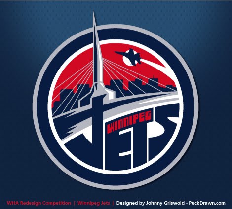
I like this one better than the first two. I think the first two would be good for a retro 3rd jersey or something like that, especially because of the Arrow. Seems more like a shoulder patch to me. They should ditch the bridge in this one too..........the Peg doesn't have one that looks like that.
Curtman @ Thu Jun 30, 2011 4:22 pm
I don't really care about the logo. There is already a whole bunch of announcements about our Downtown getting a facelift, and some new buildings. Go Jets!
Another shot for The Met
$1:
The 92-year-old heritage structure, best known as a movie house, has sat empty on Donald Street since 1987.
$75-million private development announced for downtown Winnipeg
$1:
The tower will become the home of Manitoba’s first ALT Hotel — its service style is described as ‘no-frills chic’ — and the new Winnipeg headquarters for Stantec, a Canadian-based architectural and engineering consulting firm
PimpBrewski123 @ Thu Jun 30, 2011 5:12 pm
Freakinoldguy Freakinoldguy:
Sorry, IMO kind of looks more like a bird than a jet.
What kind of bird are you talking about?
As long as it's not a Canada Geese. If so, then the Winnipeg Jets should not play anywhere near New Brunswick.
CDN_PATRIOT @ Thu Jun 30, 2011 5:25 pm
bootlegga bootlegga:
Here's another interesting one I found...although it's kinda busy.
I like this one best. The first one looks like it's from a new Molson beer or something.
-J.
ShepherdsDog @ Thu Jun 30, 2011 5:26 pm
Regina Regina:
bootlegga bootlegga:
Here's another interesting one I found...although it's kinda busy.
I like this one better than the first two. I think the first two would be good for a retro 3rd jersey or something like that, especially because of the Arrow. Seems more like a shoulder patch to me. They should ditch the bridge in this one too..........the Peg doesn't have one that looks like that.
Yup they do...the incorrectly named Esplanade Riel

Regina @ Thu Jun 30, 2011 9:54 pm
WOW.......guess it's been a while since I was in the Peg. ![]()
Unsound @ Thu Jun 30, 2011 10:06 pm
I don't like it. The first one that is. It's too generic. Too Canadian, without being Winnipeg at all. Not big on the others either. A logo should be striking but simple. Something the kids can doodle in their binders.
Curtman @ Thu Jun 30, 2011 11:02 pm
Regina Regina:
WOW.......guess it's been a while since I was in the Peg. 
Don't worry we made it real classy, and put a greasy burger joint on the bridge.

BionicBunny @ Thu Jun 30, 2011 11:47 pm
Nuggie77 Nuggie77:
Nice logo, but why would they use the silouette of the Arrow? What is the relationship between the Arrow and Winnipeg? Arrow was designed and built in Malton, Ont.
It was probably because the Avro Arrow was a Canadian creation that was ahead of it's time. It was the best of it's day and now it's a part of Canadian pride.
I think the jersey has all the right elements and retains a nice vintage look to it. I'm fond of the jersey already. It has my vote.
BeaverFever @ Sat Jul 02, 2011 2:37 pm
bootlegga bootlegga:

This is very sharp, combining the Maple Leaf, the Arrow and the blue roundel the RCAF used to use.
Of all the ones I've seen online, I think it's one of the best. What do you think?
The one on the right. The Arrow on left one looks creepy and vulgar with all those veins in it.
DanSC @ Sat Jul 02, 2011 11:35 pm
The logo above on the right is better, but the words "Hockey Club" need to go, even if that is the most official name (is it? Initial Google search is inconclusive ![]() ). It makes it sound like the shorthand name would be Winnipeg HC and Bristol Aerospace's logo would be featured prominently on the sweater.
). It makes it sound like the shorthand name would be Winnipeg HC and Bristol Aerospace's logo would be featured prominently on the sweater.